New Ways of Working Drive More Color Choices
More versatile workplace environments are fueling the creation of new complex colors.
The workplace is not a sedate environment. Now, more than ever, it’s active. People aren’t sitting in one location all day, performing a single task. Instead, they’re moving back and forth between different kinds of work modes in order to create and innovate. As we redefine the kinds of work we do, we’re also reimagining the places where we do it. People are rejecting monotonous, uninspiring spaces and seeking comfortable working environments like the ones they have at home. Colors in the workplace plays a big role as designers blur the boundaries between work and life.
“It’s a designer’s heaven,” said Bruce Smith, Steelcase director of global design. “I couldn’t be more excited about what’s going on right now. There’s an open-mindedness to the creation and application of new finishes that I haven’t seen in our industry before.”
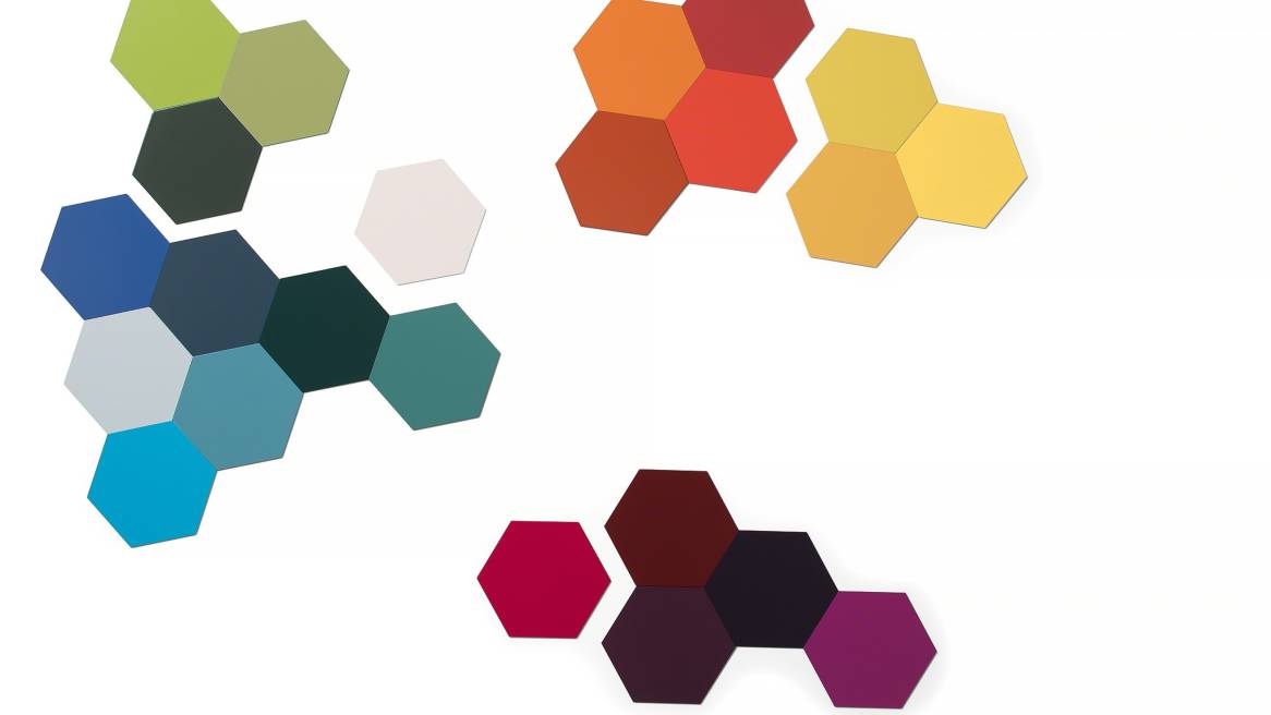
Smith and senior industrial designer, Julie Yonehara, worked with a team to create seven new color families designed to encourage creativity and self-expression, enabling designers to create spaces that are unique to organizations and individuals. 360 sat down with them to find out how they went about creating these new palettes.
360: Why does color make such an impact on people?
Bruce: What’s funny about color is everyone has a point of view about it. You can be so right and so wrong. There’s a good chance if I wear a lime green T-shirt, some people would like it and others wouldn’t. You’ll see that in the way we work through design problems. When I design a chair, I avoid putting color on a chair before we engineer it and get through the form. Color can be polarizing. It can either be somebody’s favorite or alienate them in a second.
Julie: Color is evocative of emotions and memory. When you think of the 70s, 80s and 90s, you can make up a color palette in your head. Colors are associated with brands (Coca-Cola’s red and white), genders (pink for girls), even occupations (firefighter red). Everyone has different color biases. Palettes can be meant to evoke peacefulness or energy, but people’s reaction can vary based on culture or individual preference and history. Because of the associations we have with certain colors, they can influence our emotional wellness.
STEELCASE FINISH LIBRARY
Learn about the expanding range of finishes, fabrics, and surfaces available now.
360: What trends are you seeing?
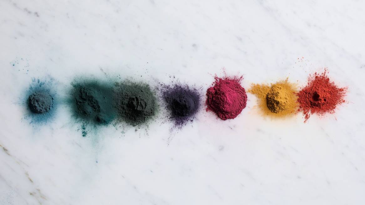
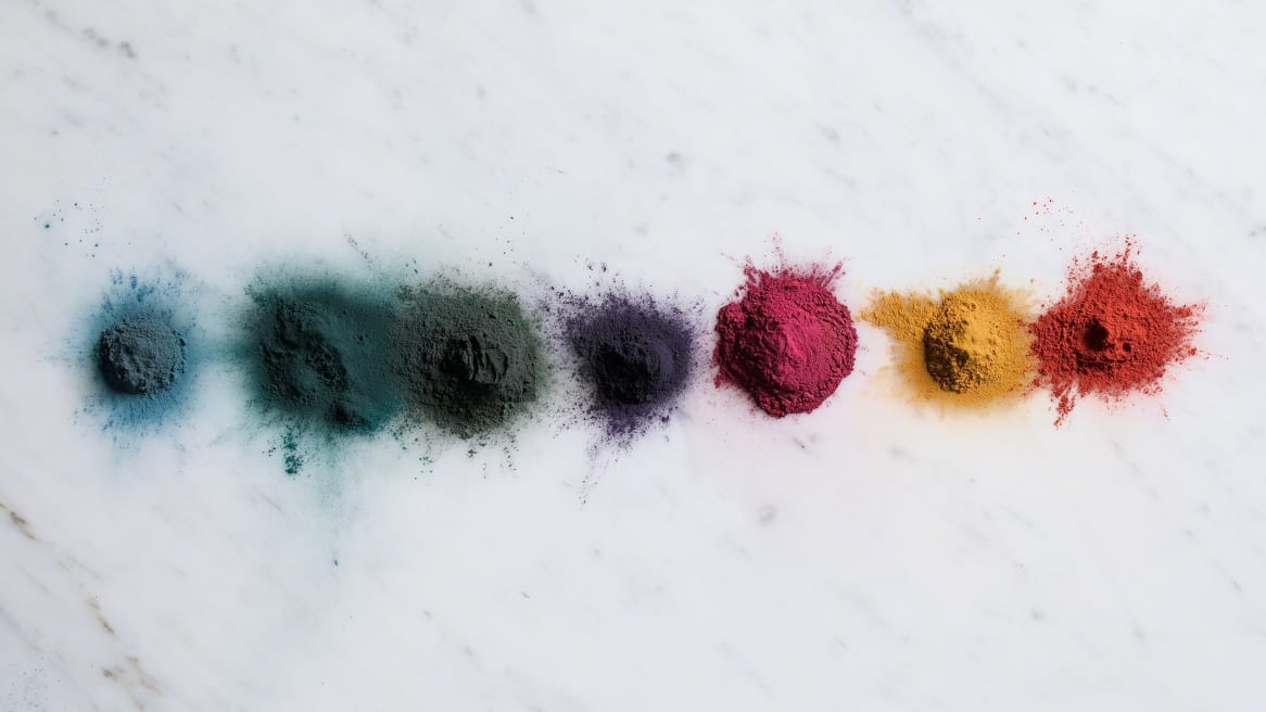
Bruce: More versatile environments are lending themselves to more complex colors. We’re constantly reviewing our existing palette to assess what’s relevant in the marketplace. This is a time to enhance our program and expand it. Just like we’re seeing more diversity and range in our materials (See: New Black, Planked Veneer, Lux Coatings), we’re seeing colors becoming richer, deeper and more moody. They are more edgy than traditional. What’s driving these shifts in the market is a desire for humanist, comforting and reflective spaces.
360: Tremendous thought went into developing these new color families. Can you give us a behind-the-scenes explanation of the process?
Julie: As we developed these palettes, we considered them in relation to the multiple materials and textures they would be translated into. We considered how color influences space design and emotionally connects to the people using the space. The colors we chose work as a system to enhance workplace design by adding to the choices we offer our customers based on interior market trends.
Bruce: We distilled what Julie references into four relevant trends that went into the creation of these colors; culture and identity, biophilia, creativity and geographical relevance.
360: Can you give us more background on those four relevant trends?
Julie: Of course, let’s start with culture and identity. We intended these colors to celebrate diversity, drawing inspiration from different cultures around the world. The colors illustrate the world we live in and what the colors mean to different people. Biophilia is this innate need for us as humans to connect with nature. People are seeking places that help them feel alive and biophilic elements support that kind of environment. This can be everything from plants to patterns on fabric. When it comes to color, all of these new colors exist in nature and are meant to evoke a rich sensory experience.
Bruce: These new choices are intended to inspire creativity and fuel innovation. Color contributes to the creation of authentic spaces people are excited to work in. At the same time, our global customers have an interest in creating a cohesive experience for the people who work in their spaces around the world. We try to provide timeless choices that apply to their canvas (walls, ceilings, floors) in ways they can leverage over time. These additional timely choices (accent colors) give a lot of control to customers and provide them with the affordances to customize their spaces based on location or culture and adjust them over time.
360: How has technology changed the way we view color?
Bruce: Technology is a large component of what’s driving the rapid rate of change. We’re all experts. You can open your computer, tour the world and see what designers are doing with color in their homes, cars or even what kind of socks they’re wearing. We’re better informed than we’ve ever been.
Julie: At the same time, social media makes certain color trends explode like Snapchat Yellow or Millennial Pink. There’s no wrong choice anymore. In the 80s, every corporate environment might have been one color. Today that’s not true. We’re seeing the blending of work, home, fashion and technology. It’s really fun, right now.
For more information on seven new colors recently released across a variety of global materials, visit the Steelcase Finish Library.