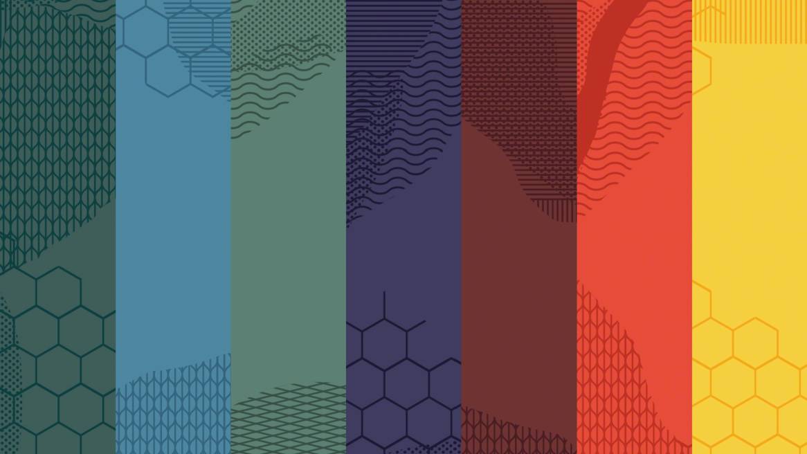
Global Trends Influence Seven New Colors
Colors signal the cultural shift in how and where work is taking place.

No matter where we live, technology allows us to experience the world like never before. Our innate curiosity can be satisfied on a whim. We can connect to people, pictures and live video from almost anywhere. We can import portions of the world at will and it’s exciting. We live in an age of plurality — a world full of color, texture and inspiration.
Julie Yonehara, Steelcase surface materials designer, works with teams based in Michigan, Munich and Hong Kong to understand why certain design directions are gaining traction and what people need in the workplace. Yonehara is seeing connections emerge between the broad themes of culture and identity, globalization, biophilia — people’s innate desire to be close to nature — creativity and how technology is influencing every aspect of our lives, tying everything together. The intersection of the drivers making up these big trends informed the creation of seven new accent color palettes for furniture recently added to Steelcase’s growing portfolio.
In today’s workplace, people are seeking places that make them feel happy, comfortable or inspired. Demands are higher because people are spending more time with technology and working longer hours. They’re also growing more sophisticated in what they like as a result of what they experience through technology and social media. More than ever, it’s the perfect time to add more color choices for workplace designers.
“The colors represent the cultural shift in how and where work is taking place. There’s more informal spaces where people can feel good like they do at home,” says Yonehara. “Color and materiality can reinforce the mood and intended use of a space. Color helps communicate permissions of the space.”
NEW ACCENT COLORS
Discover how materiality can make a difference in the workplace and download inspiration photography.
As the Surface Materials team explored what colors to add to their portfolio, they captured inspirations from around the world.
Technology + Culture
Yonehara is seeing the intersection of technology and culture contributing to the themes of culture and identity, globalization and creativity.
“Dynamic cultural tribalism is happening through technology,” she says. “We look at social media to assemble our own identities through an emotional response. This mesh of culture and technology is defining a shared language and point of view.”
At the same time, traditional craft is being rethought and reinvented with new materiality and technology elevating what we know about making. There’s a layering of past, present and future. Earthy colors are being paired with synthetic accents to create a jarring juxtaposition.
Physical + Digital
Technology and artificial intelligence are becoming more empathetic and emotional. The boundaries between the physical and the digital are starting to blur to create a new breed of hybridization. We’re already seeing the visualization of people to create an emotional response — consider emojis. And, robots that make us smile or care for us — think of Jibo, a robot that dances. This synthetic reality is another driver impacting the theme of creativity, according to Yonehara. She’s seeing colors derived from nature being dialed up. And, brilliant hyper-natural colors evolve from palettes found in nature.
Biophilia + Authenticity
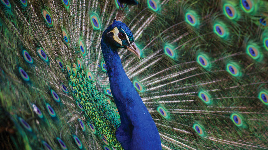
In contrast to trends driven by technology, Yonehara is seeing an elevation of environmental consciousness. People are seeking authenticity and are drawn to biophilia. This is equating to quieter, calmer spaces connecting people to materials and elevating recycled goods as luxury items — consider beautiful reclaimed wood such as Planked Veneer or closed loop textiles such as New Black. Sunbaked, raw and faded colors synonymous with nature embrace bringing the outdoors inside and help connect people to materials as they evolve over time in nature.
Wellbeing + Respite
As people work longer hours and engage more frequently with technology, luxury is being defined by privacy and being able to turn off. Attention spans are shortening, reducing productivity and damaging wellbeing. Finding time for self is crucial. Decluttering the mind benefits creativity and helps people feel better. This is leading to an evolution of biophilia and hygge (pronounced HOO-gah), the Danish concept of coziness, in the workplace. Colors emerging from this driver are soft, calm and tranquil. Yonehara is seeing more attention being paid to how color can diffuse or amplify light and how spaces can reflect or absorb sound, for example. Spaces are being designed to create tactile environments that help people feel centered and calm.
It’s this layering and plurality of trends, themes and influences that are informing the broader color choices now available for today’s workplace.
NEW ACCENT COLORS
Discover how materiality can make a difference in the workplace and download inspiration photography.
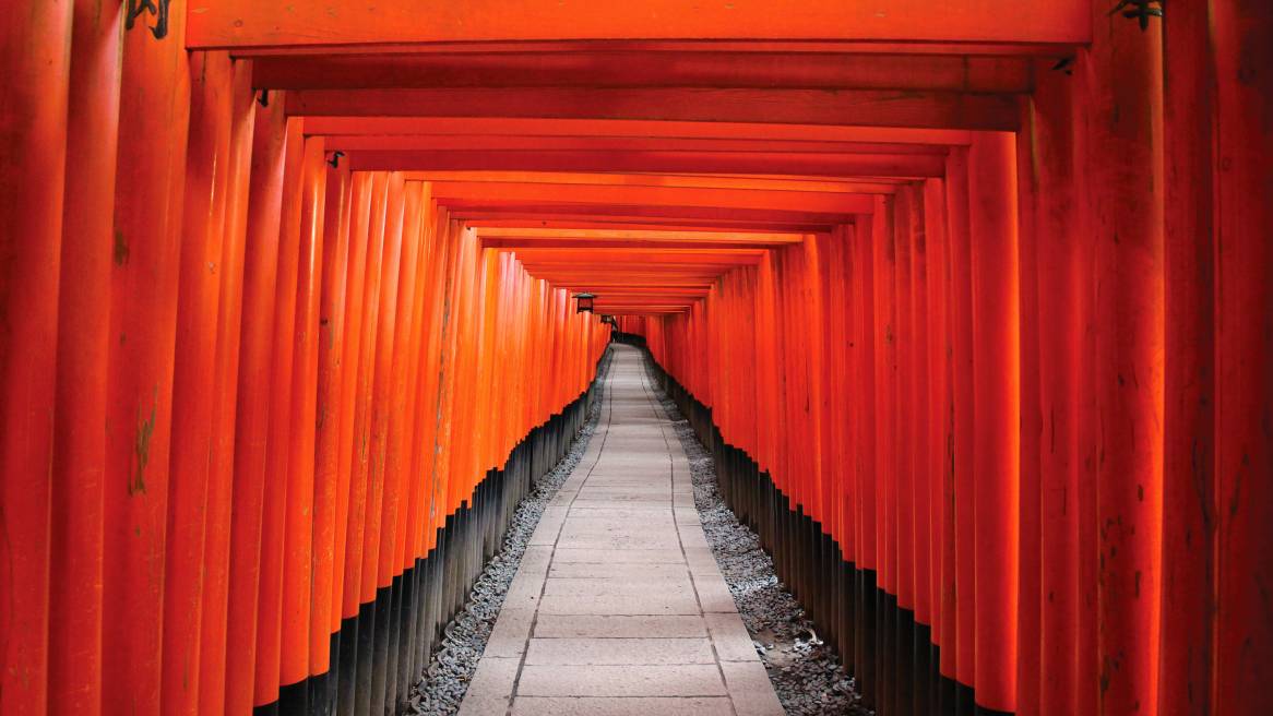
* Lead photo courtesy: Peter Gabas